Pantone's Choice of White as Colour of the Year Faces Mixed Reactions
Pantone's selection of 'Cloud Dancer' as Colour of the Year sparks debate, challenging design norms and cultural symbolism while dividing opinions among expe...
In-depth analysis
Latest releases
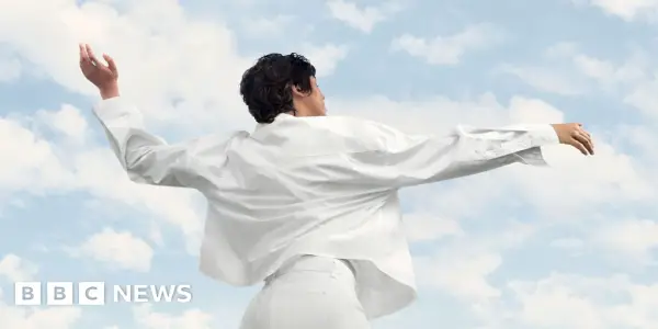
Pantone's selection of 'Cloud Dancer' as the Colour of the Year marks a significant moment in design history, being the first white shade to receive this honor. This decision has sparked extensive dialogue among designers and consumers alike, as it challenges traditional perceptions of color in aesthetic and cultural contexts, emphasizing the evolving nature of design trends.
Celebrity updates
'Cloud Dancer' has drawn attention from high-profile designers, including Chris Beaumont, who critiques its minimalist associations often seen in celebrity homes. This connection to figures like Kim Kardashian illustrates the broader cultural implications of the color choice.
Audience impact
The choice of 'Cloud Dancer' resonates with a growing consumer desire for tranquility in living spaces, reflecting a shift away from bold colors. Critics argue that this shade's clinical feel may not evoke the warmth and comfort many seek in their homes, prompting deeper discussions about aesthetic choices.
Upcoming projects
As the design community continues to grapple with the implications of 'Cloud Dancer,' future projects may explore innovative ways to incorporate this color. Designers are likely to experiment with its versatility, aiming to balance its neutrality with warmth and personality in various settings.
Did you know?
Why this is becoming a trend
The selection of 'Cloud Dancer' as Pantone's Colour of the Year reveals a growing inclination towards minimalism in design, driven by societal shifts towards simplicity and tranquility. As the pandemic reshaped our living spaces into multifunctional sanctuaries, the desire for neutral tones reflects a collective need for calmness amidst chaos. This trend highlights a deeper exploration of how color influences emotional well-being in our homes.
Behind-the-scenes secret
Pantone's decision-making process for the Colour of the Year involves extensive research and collaboration with color experts worldwide. They analyze cultural trends, societal movements, and even economic factors to ensure the chosen hue resonates on multiple levels, revealing a holistic view of color’s role in our lives.
The star's unknown story
While many associate Kim Kardashian with the minimalist aesthetic, few know that her home was inspired by her late father, Robert Kardashian, who had a passion for design. After his passing, Kim sought to create a space that felt both serene and reflective of her family's legacy. The stark white interiors symbolize not just a design choice but a tribute to her father's influence, making the color choice deeply personal and emotionally charged.
Jennifer Aniston Officially Introduces Hypnotist...
Broadway's 'The Lost Boys' Musical: A Captivating...
The Kanneh-Mason Siblings: A Family of Classical...
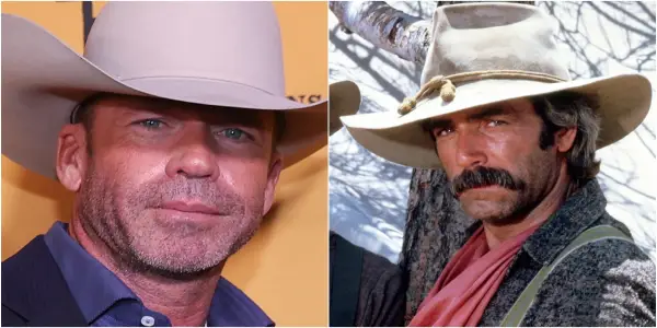
Sam Elliott Joins Taylor Sheridan's 'Landman' for...

Sean 'Diddy' Combs Navigates Early Days in...

Vince Gilligan and Rhea Seehorn Discuss...
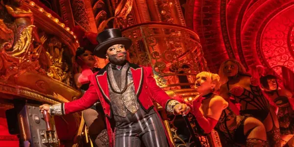
Broadway's 'Moulin Rouge! The Musical' to...
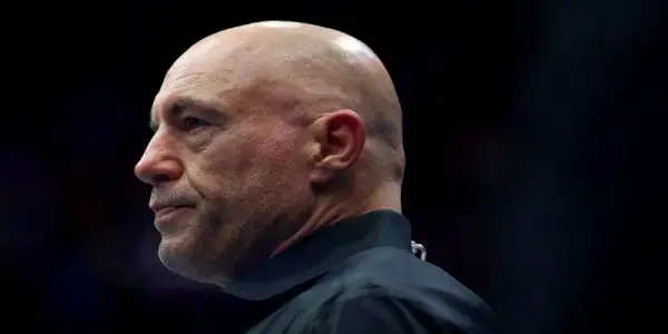
Joe Rogan's Podcast Takes the Top Spot in Apple...
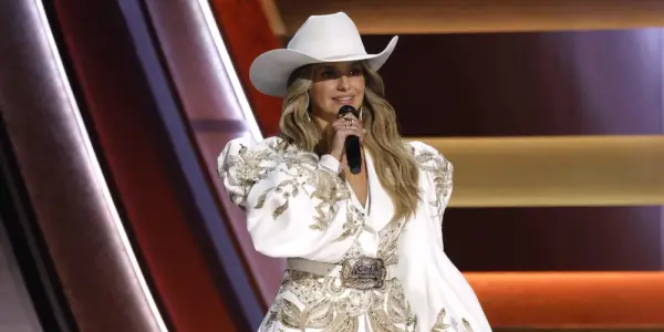
CMA Awards 2025: Highlights and Winners from a...
Whitney Leavitt to Rejoin 'The Secret Lives of...

Joe Hendry's Absence Confirmed Ahead of WWE RAW...
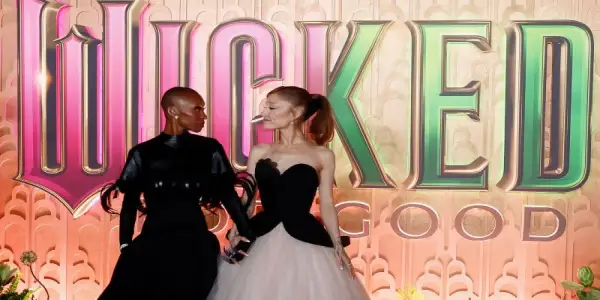
Ariana Grande Supports Cynthia Erivo Amid Voice...
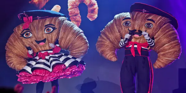
Reality Stars Behind The Mask: The Croissants...

Journey to Conclude Their Legacy with Farewell...
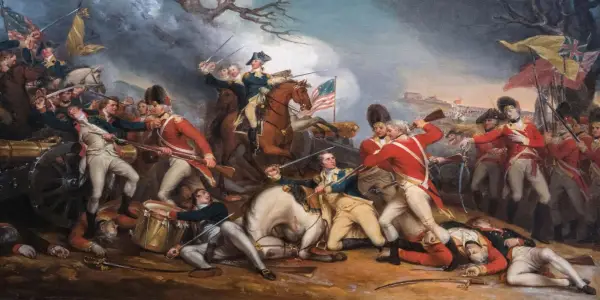
Ken Burns Explores the American Revolution, New...

Jon Stewart Extends 'The Daily Show' Hosting...
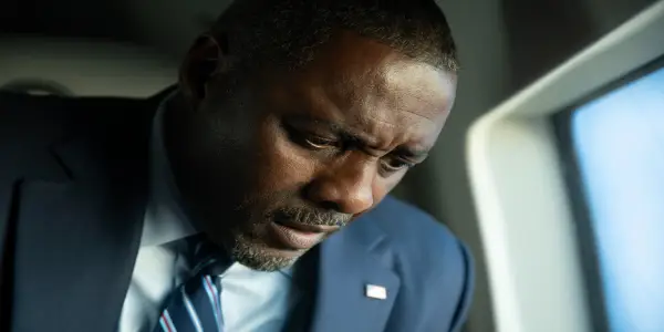
Ending Explained: Does Idris Elba's President...

Isabelle Tate, 23, Passes Away from Rare Disease;...
Nuremberg Film Sparks Debate Over Psychiatric...
Luna's Desperate Escape Unfolds in Bold &...
Eddie Murphy's New Documentary Explores His...
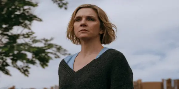
Netflix's 'The Beast in Me' Features Claire Danes...
Duffer Brothers Share Insights Ahead of 'Stranger...
Duffer Brothers Discuss Major Revelations in...

Jennifer Lawrence Reflects on Past Interviews,...

MTV Cancels Long-Running Series 'Ridiculousness'...
Erika Kirk Reflects on Jimmy Kimmel Controversy...

Will Smith Embarks on Antarctic Expedition with...
Nelly Furtado Announces Hiatus from Live...
WWE Announces Latest Round of Talent Releases,...
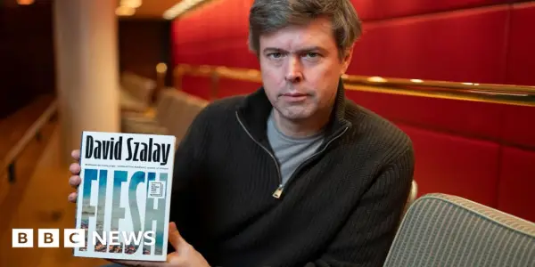
David Szalay's 'Flesh' Wins 2025 Booker Prize

Allison Mack Opens Up About Her NXIVM Experience...
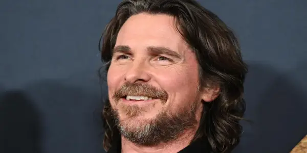
Christian Bale in Talks for Role in Michael...
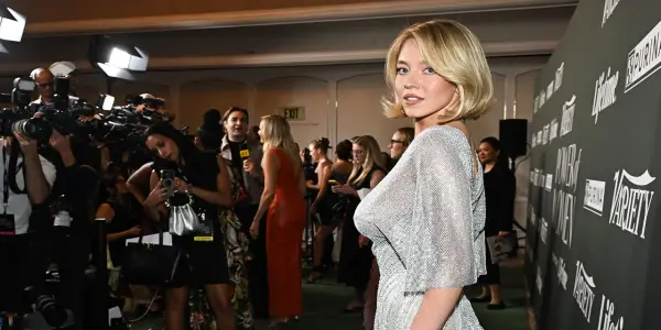
Sydney Sweeney Faces Mixed Reactions Over Sheer...
Mentalist Oz Pearlman Captivates Audiences with...
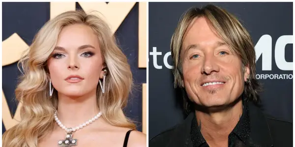
Keith Urban, 58, Sparks Romance Rumors with...

Season 4 of 'Mayor of Kingstown' Premieres with...
Mon Rovîa's 'Bloodline': A Deep Exploration of...
Unresolved Mysteries in the 'Stranger Things'...